


The Psychology Behind Color Choices in Digital Marketing and Branding
Color is far more than a visual element, it is a powerful psychological trigger that shapes emotions, influences decisions, and impacts how customers perceive a brand. In digital marketing and branding, color choices have the ability to attract attention, guide user behavior, and inspire trust. Whether a brand aims to feel energetic, luxurious, trustworthy, or youthful, the right color palette can silently communicate all of these traits within seconds.
In the age of digital-first experiences, understanding the psychology behind color has never been more important. Modern consumers rely heavily on visual cues when browsing websites, engaging with ads, or interacting with digital products. This is why brands often choose their color palettes strategically, sometimes with the help of a leading website development company in Noida, which ensures design, branding, and user experience align with brand goals.
Why Color Psychology Matters in Digital Marketing
Colors evoke emotional responses even before users read a single word. Studies show that people form an impression about a brand within 90 seconds, and up to 80% of that impression is influenced by color alone. This makes color psychology one of the most valuable, yet often overlooked, tools in digital marketing.
When applied correctly, color can:
- Improve website engagement
- Strengthen brand recall
- Increase conversions
- Enhance readability and aesthetic appeal
- Build trust and emotional connection
Brands often collaborate with digital marketing experts in Noida to ensure their color choices support the brand identity, appeal to the target audience, and boost conversion rates across digital platforms.
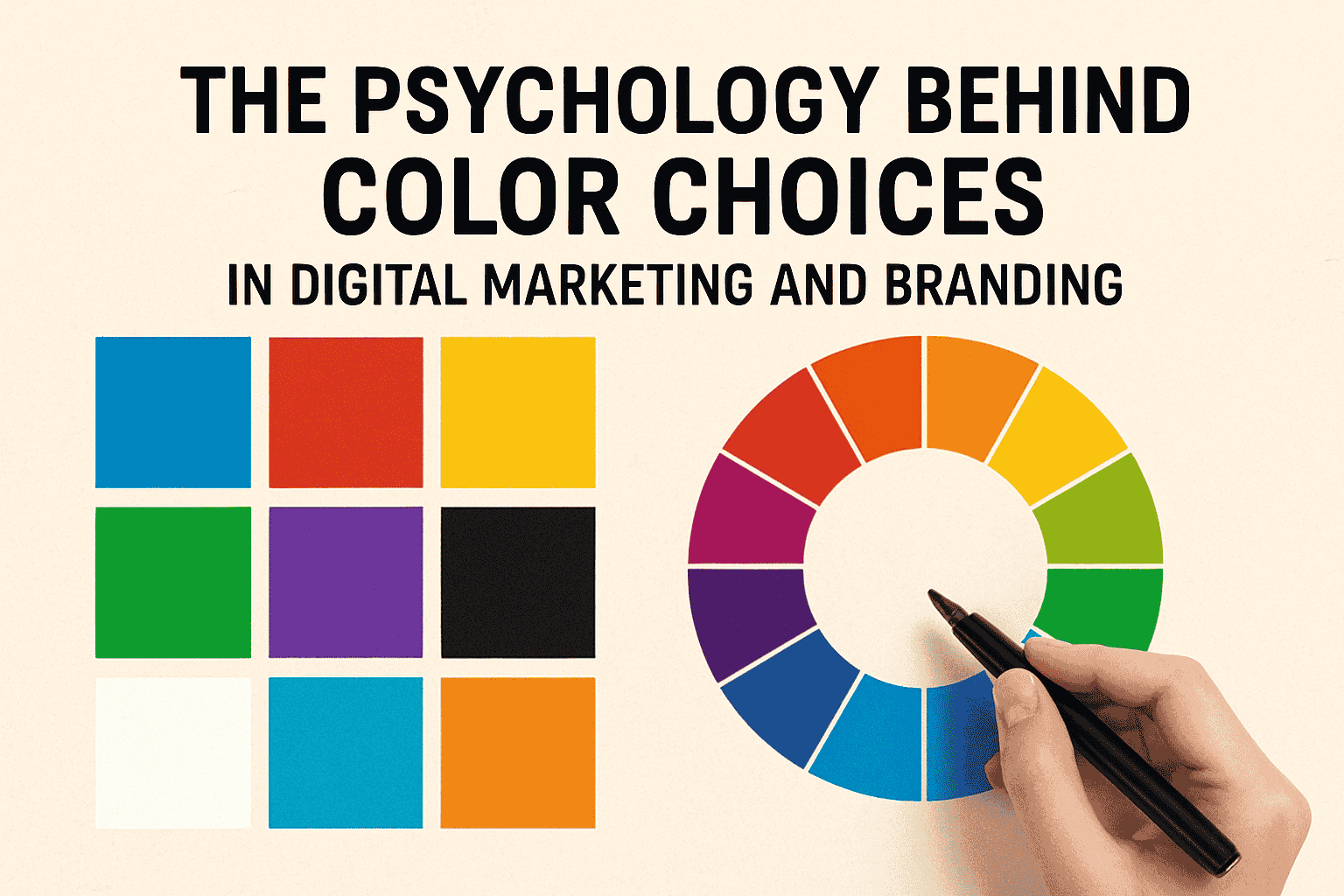
The Meaning of Popular Colors in Branding
Different colors convey different emotions and messages. Here’s what some of the most commonly used colors represent:
Blue – Trust, Dependability, Calmness
Used heavily by finance, healthcare, and tech companies to build confidence and reliability.
Red – Energy, Urgency, Excitement
Perfect for sales banners, call-to-action buttons, and brands that want to create bold, impactful statements.
Yellow – Positivity, Happiness, Warmth
Often used for youthful, friendly brands that aim to spread cheerfulness and optimism.
Green – Growth, Balance, Health
Associated with eco-friendly brands, wellness industries, and anything related to sustainability.
Purple – Luxury, Creativity, Royalty
Great for premium, creative, or imaginative brands seeking a sophisticated appeal.
Black – Power, Elegance, Premium Feel
Used by luxury brands and minimalist digital interfaces for a sleek, high-end feel.
White – Simplicity, Purity, Minimalism
Creates spacious layouts and a modern, clean user experience.
How Color Influences Online User Behavior
Color doesn’t just shape perception; it actively drives user actions. Here’s how:
1. Color Affects Buying Decisions
A well-chosen color can strengthen the desire to purchase. For example, red increases urgency, making it effective for limited-time offers.
2. Color Improves Brand Recognition
Consistent use of brand colors can boost recognition by up to 80%. This is why brands maintain strict visual guidelines across their digital presence.
3. Color Impacts User Navigation
Buttons, menus, and CTAs rely heavily on color contrast for visibility and usability. A strategically colored CTA can significantly increase conversion rates.
4. Color Creates Emotional Connection
Different audiences respond uniquely to colors based on age, culture, and personal experiences. Understanding these variations helps brands connect more deeply with their target market.
Choosing the Right Colors for Your Brand
Selecting the perfect brand colors requires more than picking what looks aesthetically pleasing. It involves:
- Understanding the target audience
- Defining your brand personality
- Evaluating industry trends
- Ensuring accessibility (contrast, readability)
- Testing variations for performance
Here are practical tips to get started:
✔ Create a Color Palette Strategy
Combine primary, secondary, and accent colors that reflect your brand’s identity and messaging.
✔ Consider Contrast and Accessibility
High contrast improves readability and navigability which is crucial for websites and apps.
✔ Test Your CTA Colors
Different colors can produce different conversion results. A/B testing helps identify what works best for your audience.
✔ Keep It Consistent
Using the same color palette across social media, websites, ads, and packaging strengthens brand recognition.
The Future of Color in Digital Branding
With the rise of AI-driven personalization, brands are now exploring dynamic color strategies that adapt based on user behavior and preferences. Dark mode vs. light mode designs, emotionally adaptive UI, and hyper-personalized visuals are shaping the next era of digital experiences. As technology evolves, color psychology will remain at the core of brand identity and consumer engagement.
Conclusion
Color is a silent but powerful storyteller in the world of branding and digital marketing. It shapes emotions, influences decisions, and defines how customers perceive a brand. Understanding color psychology allows businesses to craft meaningful experiences that resonate deeply with their audience. And when it comes to implementing strategic, impactful color choices, Digi Global Tech continues to help brands build stronger, more memorable digital impressions.